
Dashboards at both altitudes, not one
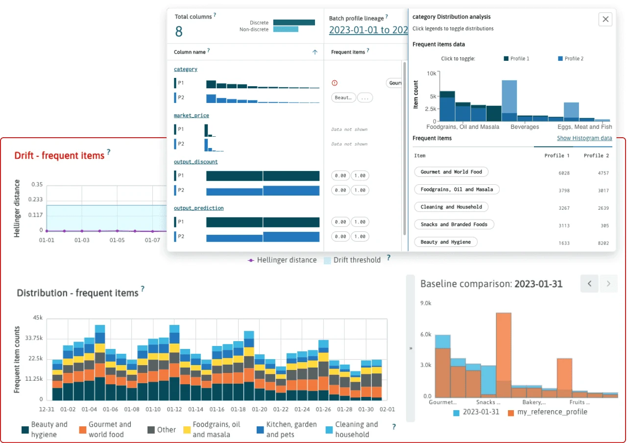
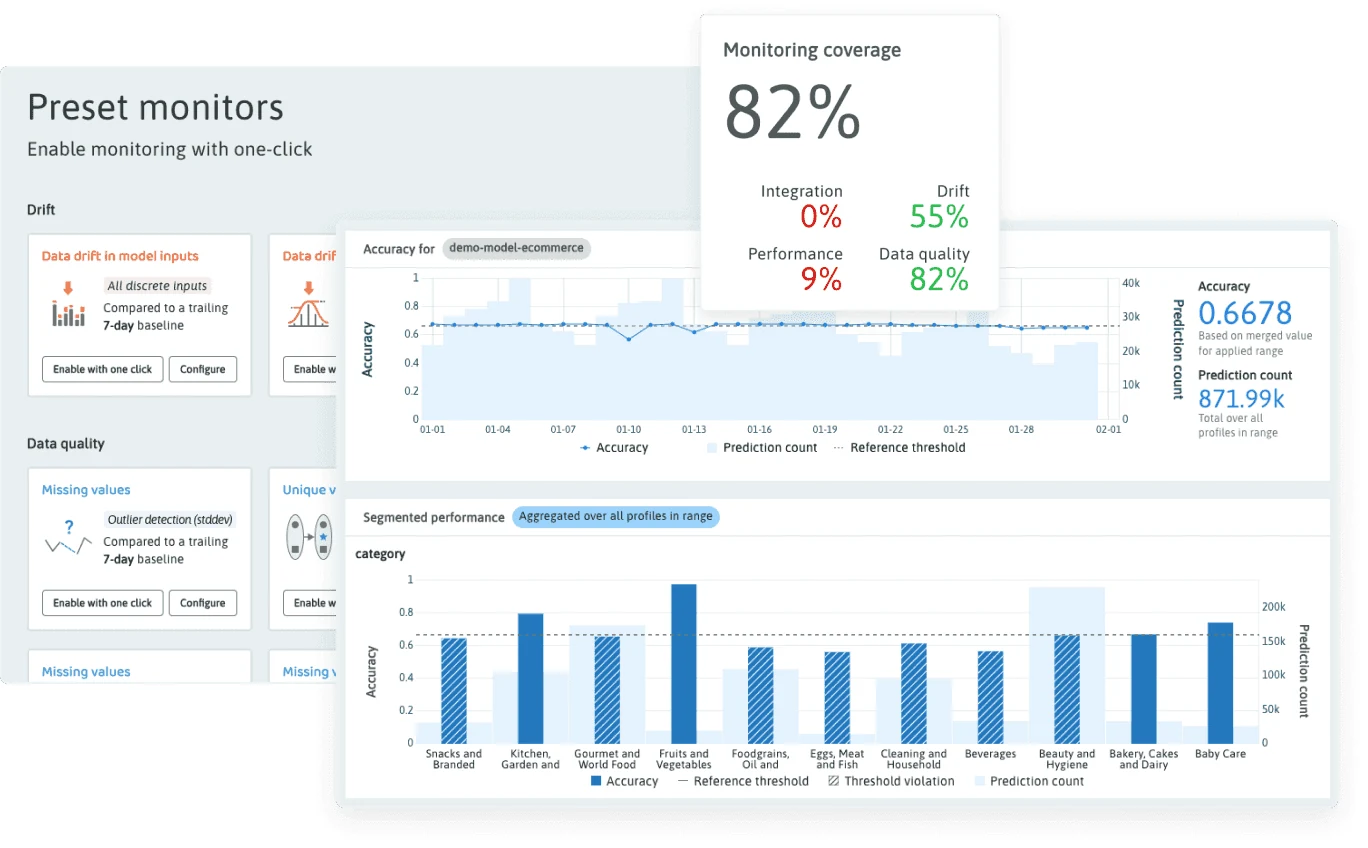
A monitoring product is used by two people who want opposite things. Somebody responsible for a fleet needs to know whether anything is wrong anywhere, this morning, in one glance. Somebody debugging a specific model needs every column it saw and what each of them did. Build only for the first and the second gives up; build only for the second and the first never opens it. So we built both: the Project Dashboard and All Resources for operational health across the estate, an Overall Summary above them, and the single-resource view underneath with its profile comparison, its feature table and its per-column drilldown.
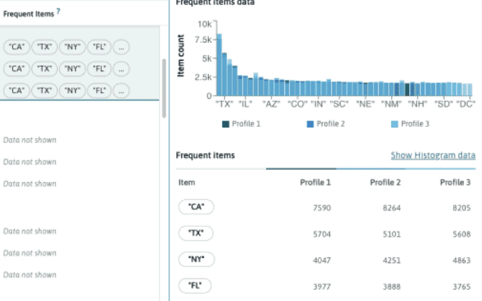
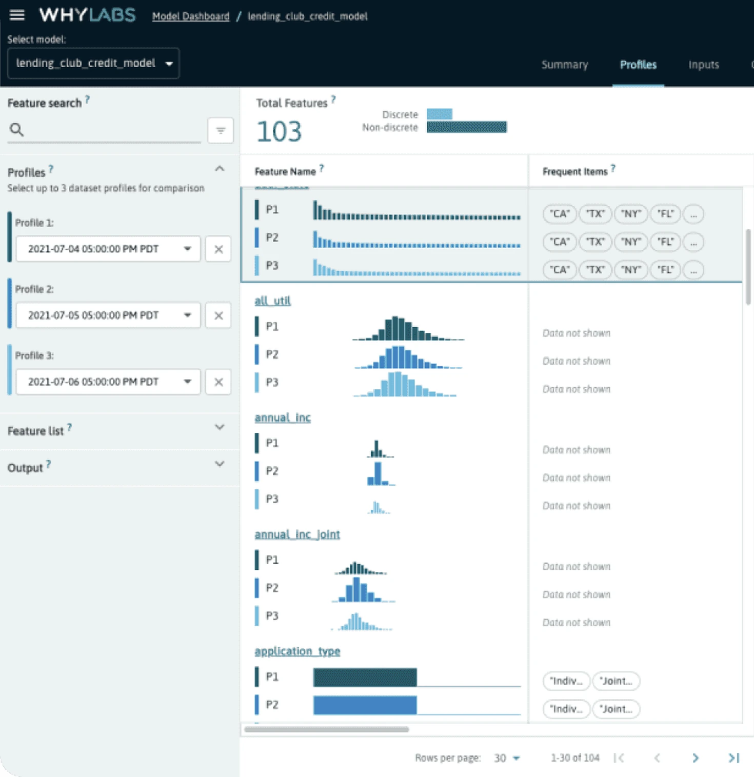
The single-resource view is where the profile machinery shows. Every column a model saw, its distribution drawn inline once per profile, its frequent items beside it, and up to three profiles held side by side so a Monday and a Thursday sat on the same row. None of that was plotted from data. Each of those distributions was a custom component drawing a whylogs sketch, which meant the binning had to be reconciled across profiles before anything could be compared, or three histograms of the same column would disagree about their own axis.
- Project Dashboard
- All Resources & Overall Summary
- Profile Comparison
- Feature-Level Debugging